01
What this sample is
A complete record of one Single Fix completed and tested in a separate, unpublished theme copy.

Controlled sample
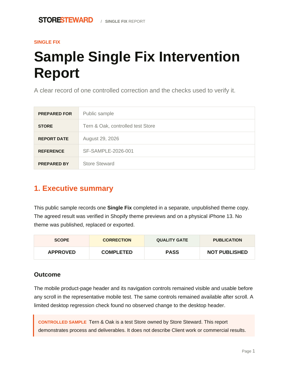
This report documents one controlled Single Fix on Tern & Oak, a private Shopify test Store controlled by Store Steward.
It records the agreed result, the isolated correction, the evidence used for review and the decision to keep the theme unpublished.
This is not client work or evidence of a commercial result. The test Store address and private access details are withheld.
6-page report. One correction. Five quality checks. Not published.
 Approved sample report
Sample disclosure
01
A complete record of one Single Fix completed and tested in a separate, unpublished theme copy.
02
It is not a client case study, a testimonial or proof of sales, conversion, revenue or compliance results.
Intervention summary
The mobile product-page header appeared empty when the page first opened. Navigation controls became visible only after the visitor scrolled.
The agreed result was simple: the header and its navigation controls had to remain visible and usable before any scroll on a representative mobile viewport.
The corrected state met that result in theme previews and on a physical iPhone 13. A focused desktop check found no observed change to the desktop header.
Intervention SC-002
Before
The issue was reproduced on representative mobile product pages in the controlled Before theme. The header controls appeared after the page moved.
After
On the physical iPhone 13, the menu, search, logo, account and cart controls were visible and usable in both states.
The corrected theme remains unpublished. Publication is a separate action and still requires Bruno's express written approval.
Change boundary
A responsive CSS rule was added to one stylesheet in one unpublished working copy. It applies only to product pages at mobile widths.
Quality verification
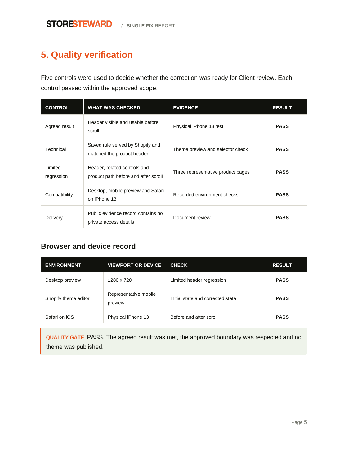
The correction was not marked ready for review until the agreed result, technical change, related path, compatibility and delivery record had been checked.
| Control | What was checked | Evidence | Result |
|---|---|---|---|
| Agreed result | Header visible and usable before scroll | Physical iPhone 13 test | Pass |
| Technical | Saved rule served by Shopify and matched the product header | Theme preview and selector check | Pass |
| Limited regression | Header, related controls and product path before and after scroll | Three representative product pages | Pass |
| Compatibility | Desktop, mobile preview and Safari on iPhone 13 | Recorded environment checks | Pass |
| Delivery | Public evidence record contains no private access details | Document review | Pass |
Quality gate: Pass. The agreed result was met, the approved boundary was respected and no theme was published.
Inside the report
Clear limits
The physical iPhone 13 check covered the Oakland Merino Crew product page. Theme previews covered three representative product pages.
The desktop check was limited to the header at 1280 × 720. This was not a complete Store, application, checkout, SEO, accessibility or security retest.
No commercial result, conversion improvement or compliance outcome is guaranteed. The live Store was not changed.
Read the complete sample
Download the six-page report to review the approved scope, correction, evidence, quality checks, limits and publication status together.
Controlled test Store. Private URL withheld. No client or commercial result claimed.